设计
input组件单独使用时,在样式上并没有多花里胡哨,较为简洁纯粹。 相较于element组件库中的input组件,这里的实现上应该也就只有边框颜色没有特意设计(element有主题系统)。
功能的设计上也略微简陋,没有针对各种type做相应的实现,目前只实现了input的类型。没实现的还有显示icon以及设置组件自身大小。
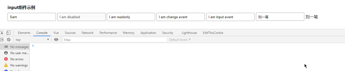
效果
属性
value,组件的核心功能,显示输入的内容,这也为该组件实现双向绑定的必要条件之一。
disabled,组件状态是否被禁用。
readonly,和禁用很像,只不过在表现形式上有略微差距,设置组件状态是否只读。
事件
change,输入内容发生改变后触发,但和input不同的是,change更“防抖”。
input,实时响应输入框的值变化。
blur,输入框的失焦事件,可用于相关状态的绑定。
focus,当输入框获得焦点的事件。
代码
vue
<template>
  <div class="wrapper" :class="{error}">
    <input
      :value="value"
      type="text"
      :disabled="disabled"
      :readonly="readonly"
      @change="$emit('change', $event.target.value)"
      @focus="$emit('focus', $event.target.value)"
      @blur="$emit('blur', $event.target.value)"
      @input="$emit('input', $event.target.value)"
    />
  </div>
</template>

<script>
export default {
  name: "wick-input",
  props: {
    value: {
      type: String
    },
    disabled: {
      value: {
        type: Boolean,
        default: false
      }
    },
    readonly: {
      value: {
        type: Boolean,
        default: false
      }
    },
    error: {
      value: {
        type: String
      }
    }
  }
};
// 为什么用readOnly做变量名就不行,导致属性只能传递到div上,
// 而必须使用readonly
</script>

<style lang="scss" scoped>
$height: 32px;
$border-color: #999;
$font-size: 14px;
$border-color-hover: #666;
$box-shadow-color: rgba(0, 0, 0, 0.5);
.wrapper {
  display: inline;
  font-size: $font-size;
  > input {
    height: 32px;
    border: 1px solid $border-color;
    border-radius: 4px;
    padding: 0 8px;
    &:hover {
      border-color: $border-color-hover;
    }
    &:focus {
      outline: none;
      box-shadow: inset 0 1px 3px $box-shadow-color;
    }
    &[disabled] {
      cursor: not-allowed;
    }
  }
}
</style>